
How Ben McCarthy is bringing Obscura’s vision to photo editing
We spoke with Obscura Studio’s creator, Ben McCarthy, to learn how their new app strips photo editing down to the essentials — and why thoughtful design sometimes means doing less.
For over a decade, Ben McCarthy has been building iOS apps — including their much-loved camera app Obscura. Their latest release, Obscura Studio, takes that same sharp attention to detail and channels it into a focused, standalone editor. It’s fast, minimal, elegant — and built entirely in Sketch.
We caught up with Ben to hear about the path that led to Studio, the challenges of designing for tiny spaces, and what ten years of indie app development teaches you about knowing when to build, when to simplify, and when to start fresh.
Could you describe Obscura Studio and what motivated you to start working on it — and also why you built it as a separate app from Obscura?
Last year, Apple introduced the Lock Screen Camera extension, allowing for third party camera apps to be launched from the lock screen without having to authenticate (with FaceID, TouchID, or your passcode) making it much faster and more convenient to use Obscura. It’s an amazing feature that I’m tremendously grateful for, but due to the security requirements, it completely upended how things like preferences and the photo library integration have to be handled.
So I’ve been working on rewriting Obscura and doing my best to break it into separate components to make running in the Lock Screen extension more streamlined. I also wanted to revamp how Obscura’s filters are created, so I built myself a small app that would let me tweak the filters with a GUI (Graphical User Interface) rather than editing them in code. I then realised that I’d created the foundations of a photo editor and I could integrate that with the photo library component of the Obscura rewrite to have more or less a complete product.
The plan was (still is?) to integrate this new editor into Obscura, but I also realised that it would make sense as its own standalone app. On the Mac, I can just ship Obscura Studio without the confusion of marketing a camera app with no camera. And on the iPhone and iPad, it can be really convenient to just jump straight into editing without having to launch the camera first.
One of the things that stood out to me while using Studio was its simplicity. How did you approach the interface design? Was there a part of the UI or interaction design that was especially tricky to get right?
All the apps I build are to scratch my own itch. Either there’s no app that solves the problem I have, or I’m not quite happy with how other apps handle it. That naturally leads to simpler interfaces — because I’m designing for how I want things to work. If something frustrates me, I assume it frustrates other people, too.
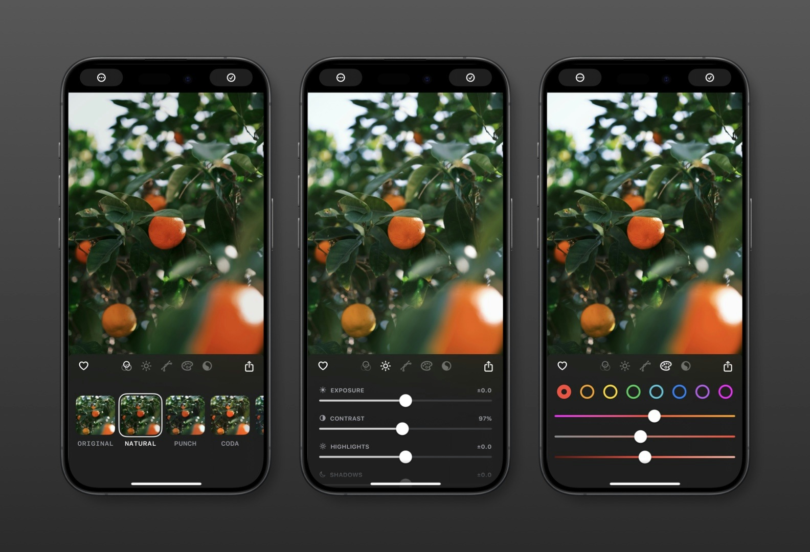
The main challenge was just getting the editing interface to fit in the little space you have underneath a photo. I’ve had quite a bit of experience with fitting Obscura’s camera controls into a similar layout, but Obscura Studio also has to deal with scrolling views and tabs, which adds to the complexity, especially when it comes to gesture handling.
What’s something in Obscura Studio that most people might not notice, but you spent a lot of time refining?
Maybe the most complicated aspect of the app is how it stores and restores edits. Obscura Studio maintains its own record of the edits you’ve made for each photo, but also saves those edits to the system photo library when you save a photo. So the app has to seamlessly switch between the edits stored in the photo library and the active edits managed by Obscura Studio. Getting that to work smoothly and quickly, especially as you scroll through the gallery took a lot of work to get right.
Has building tools like Obscura changed how you approach photography or product design more broadly?
When I first got into photography, I spent a lot more time sitting at my desk playing with photos in Photoshop, clone-stamping away telephone wires and just putting way too much time into individual photos. As photography has become increasingly mobile, and just sharing something quickly is more common. So if I can make an image look at least a little nicer in 30 seconds, that’s so much better than spending a week telling myself I’ll get around to editing a batch of photos in Lightroom on my desktop, and inevitably forgetting.
Could you share some advice to someone starting out in product design today?
I think one thing that can be intimidating is the feeling that every good idea has already been built. And in so many cases, that’s true, but just because an app exists to solve a problem, doesn’t mean it’s the best it can possibly be. Maybe it takes too many taps to do something, because the feature you find most useful is an afterthought to the developer, or maybe you just don’t like the colours they used. Don’t be afraid of competition, it means you’re all onto something good.
Obscura turns 10 this year — congrats! How has your approach to designing products evolved over time? And how has working across different kinds of apps shaped the way you think about product design?
In some ways my approach has evolved very little. Since I started making apps I’ve been designing in Sketch and building in Xcode, and while they’ve certainly evolved quite a bit over the last decade, the overall workflow is very much the same.
I think I’ve gotten a better sense over time of when to rely on system components which are convenient and the user is already familiar with them versus custom controls that let you tweak the behaviours exactly how you want them. Obscura Studio uses custom sliders, because I wanted the user to be able to tap the slider track to nudge the values up or down, or double tap the thumb to reset the value to zero, but otherwise are hard to distinguish from Apple’s sliders.
Across all the apps I’ve built, and the apps I’ve consulted on for others, the common goal is just working out what’s most important to the user and how can you make that easy and intuitive. Whether it’s a camera app, an app for cross-posting, or a Pokédex, I ask what controls or information does the user need access to fastest, and then I start to build the app around that.
Are there any other Sketch features you’ve found especially helpful in your day-to-day, beyond what you shared with us before in our Callsheet interview?
What I love most about Sketch is that I can iterate on designs about as fast as I can think. I don’t think I’m a very sophisticated user of all the features, as long as I can get ideas out without any fuss I’m very happy. That said, I’m really liking the improvements to how groups handle resizing in the recent updates, it feels much more intuitive. And the quick updates to Apple’s UI libraries are always appreciated.
So, to wrap things up — we’d love to know what’s next. Anything you can share with us?
I’ve got a few things I’m keen to do soon. The iPad and Mac version of Obscura Studio is high on that list, as is finishing Obscura’s rewrite so that the two apps can be better integrated. A crop tool also needs to happen sooner than later. Beyond those, I don’t have anything major planned, I just need to keep iterating and polishing.
Want to try Obscura Studio for yourself? You can download the app from the App Store. And if you’ve created something you’re proud of using Sketch, post it in our community forum — we’d love to see it.


